Virtual Therapy Marketplace Web App
Theraspace
Making it easy to find and connect with therapists virtually.
Summary
I independently designed Theraspace as a self-initiated UI/UX practice project to strengthen my product design skills. The goal was to create an intuitive virtual therapy marketplace that helps people easily discover and connect with licensed therapists based on their needs. I led the entire process end-to-end — from research and information architecture to wireframes, and visual design.
At a Glance
My Role
- Porudct Designer (solo project)
- August 2022
My Approach
Theraspace was a fully self-directed UI/UX practice project where I independently defined the problem space, researched user needs, and designed the complete end-to-end experience. I treated this as a real product simulation — applying structured UX methodology, information architecture, and high-fidelity UI design to build an intuitive, emotionally-aware product from scratch.
Competitive Analysis
Analyzed BetterHelp, MyChart, Alma, Grow Therapy, and Psychology Today. While each platform supports some portion of the mental-health journey, most create friction through outdated interfaces, directory-style browsing, or disconnected booking & insurance steps.
The opportunity: Create a guided, consumer-friendly therapy marketplace that simplifies matching, booking, and intake into a single, cohesive pathway.
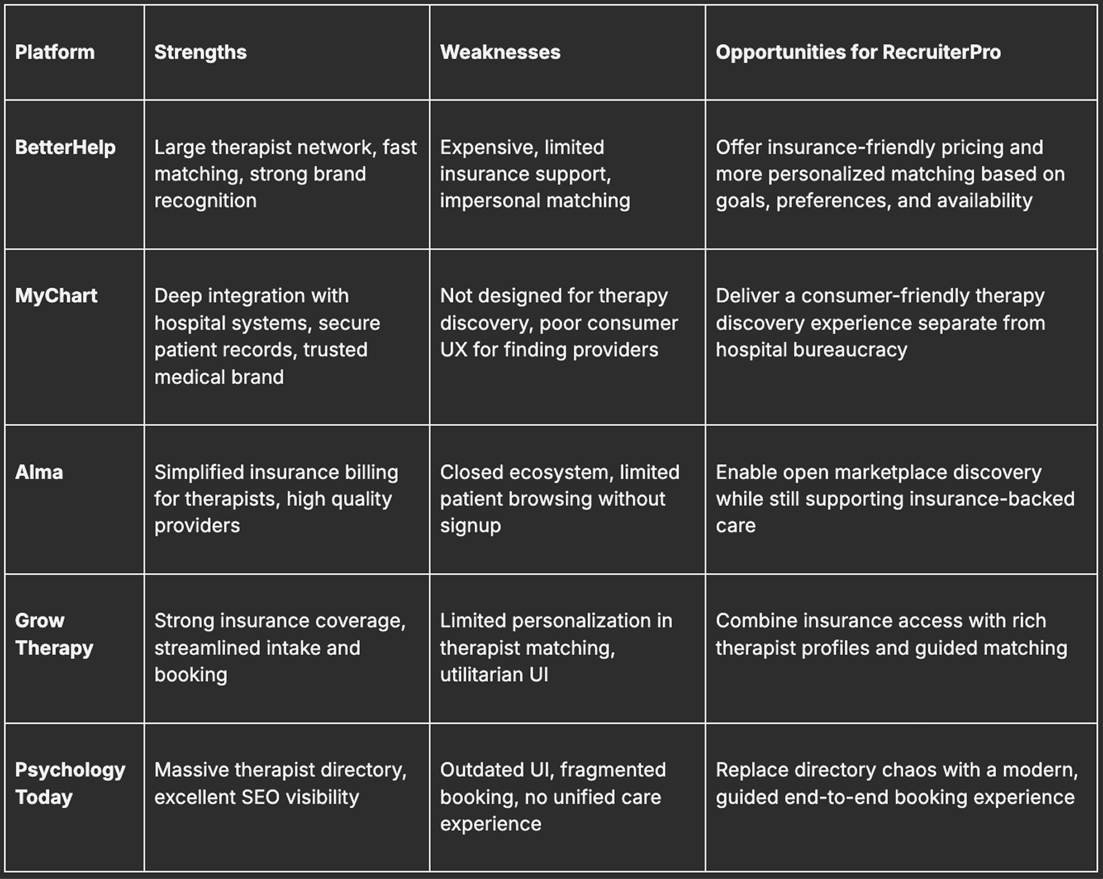
Visual: Competitive matrix
Information Architecture (Clarity Before UI)
Since this was a solo project, I owned the full structural strategy. I mapped the entire experience flow from scratch:
Home → Search → Filters → Therapist Profiles → Contact
My goal was to:
- Minimize cognitive load
- Reduce unnecessary decision points
- Keep users focused on discovery and comparison
- Build trust through clarity and consistency
High-Fidelity Design
After validating the wireframes, I moved into high-fidelity mockups in Figma. My goal was to make the interface calm, clear, and trustworthy.
Therapist Cards
- Scannable, essential info
- Clear specializations
- Trust-building elements like “Top Rated” chips
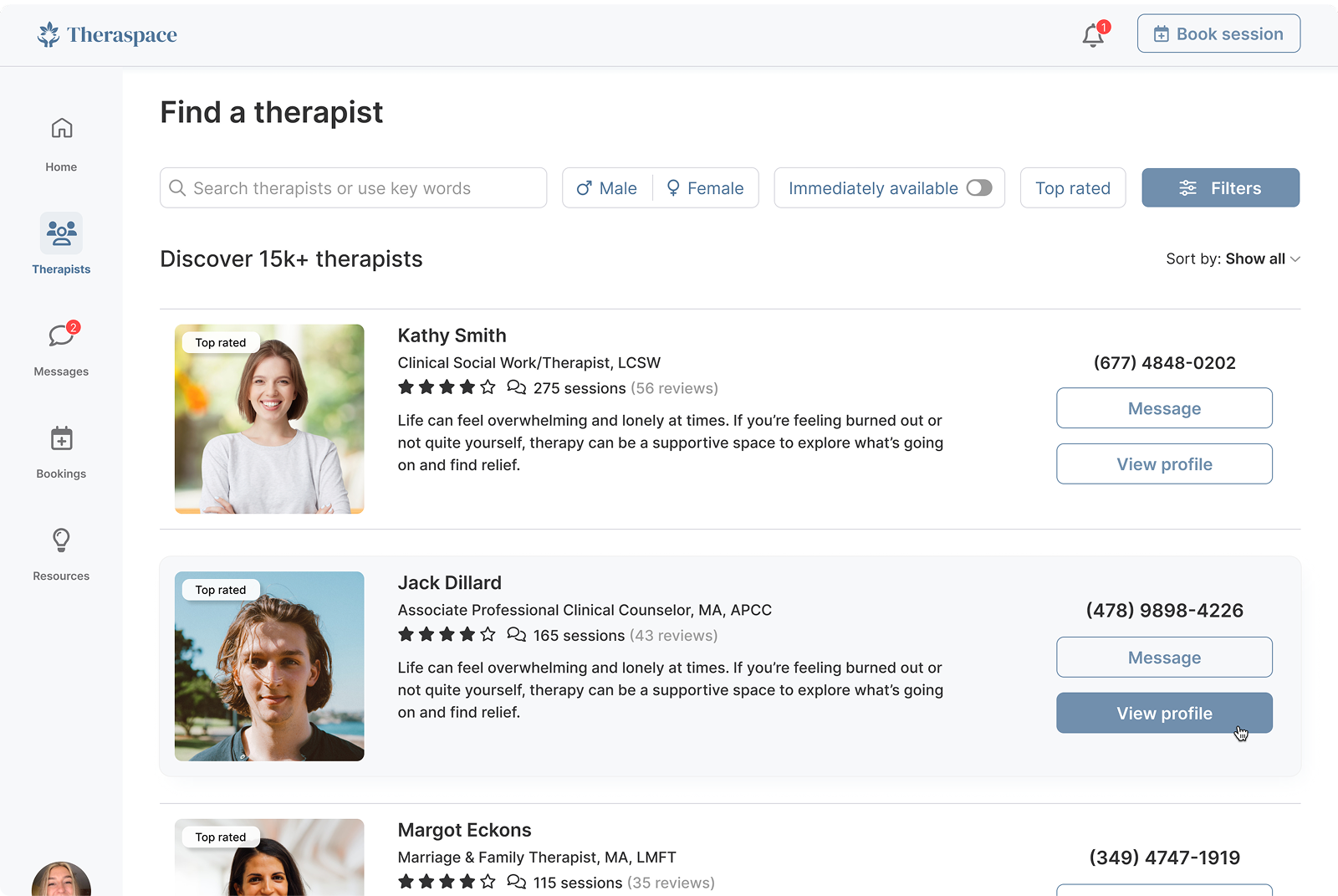
Visual: Search
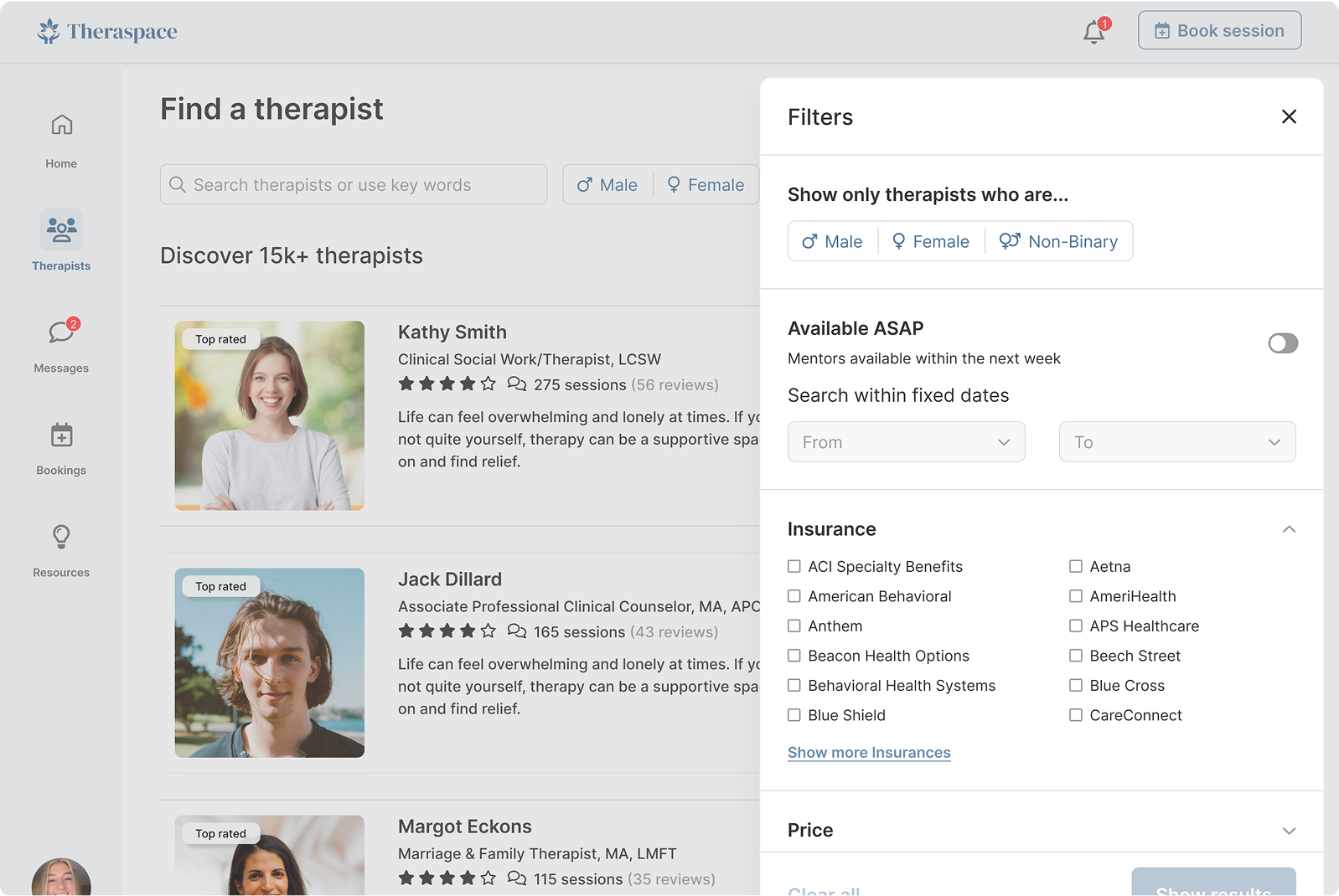
Search & Filtering
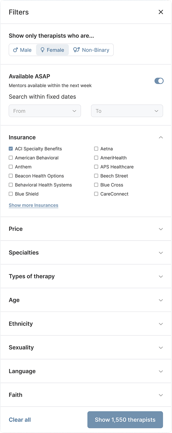
- Collapsible filters to reduce overload
- Simple, predictable sorting
- Clean, approachable UI
Visual: Search
Overall Visual System
- Soft colors and high readability
- Spacious, comfortable layouts
- Minimal visual noise
- Warm but professional tone
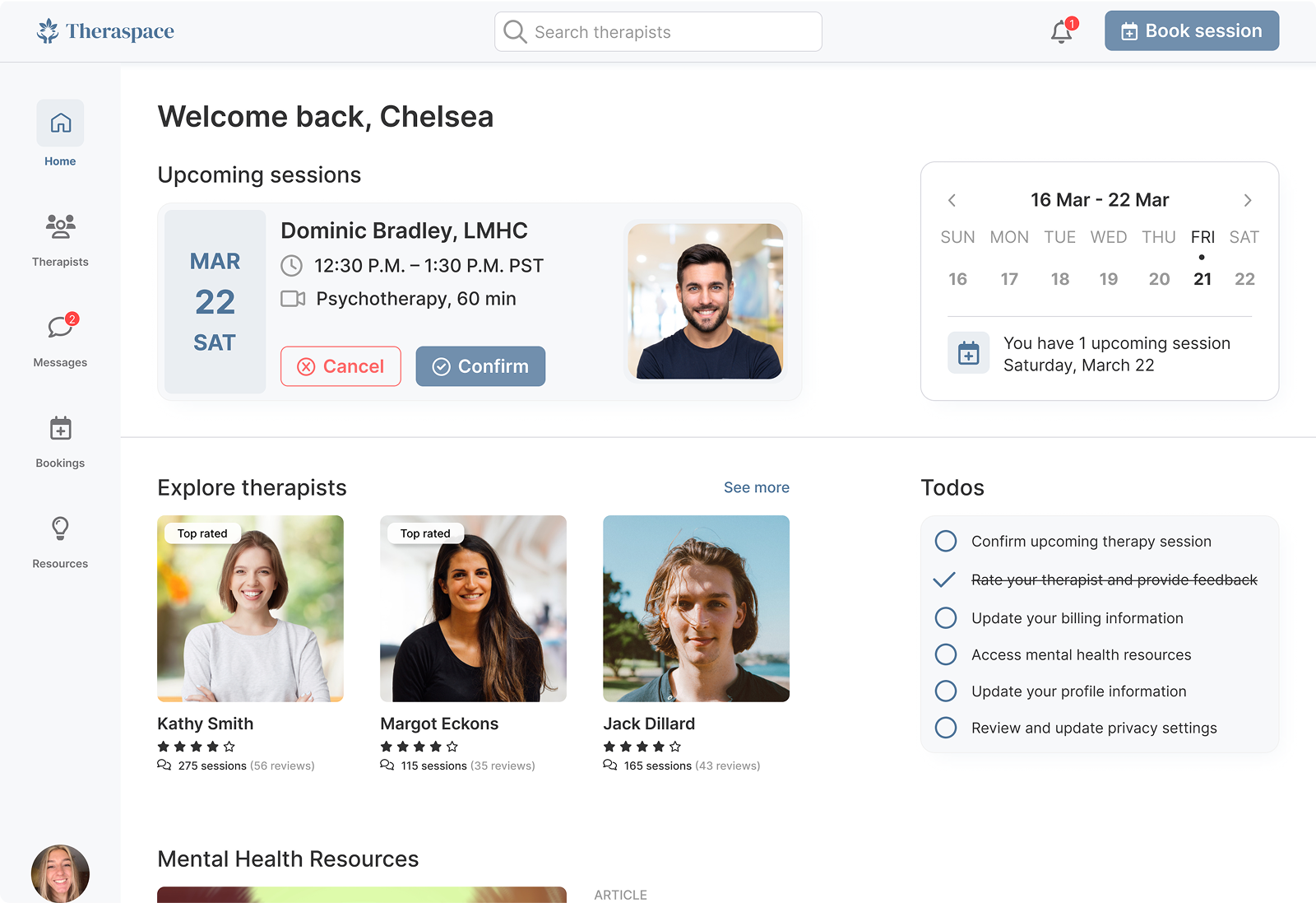
Visual: Dashboard/Home
What I Delivered
As a solo practice project, success was measured by what I learned and strengthened, including:
- Designing an emotionally-aware product from scratch
- Practicing end-to-end UX thinking without external constraints
- Building a calm, frictionless browsing experience
- Creating a polished UI that reflects therapeutic values
- Refining my skills in IA, hierarchy, visual clarity, and UX decision-making
Reflection
If I continued this project, I would:
- Conduct real user interviews and usability tests
- Add behavioral analytics to understand search/filter patterns
- Expand the design into mobile variations
- Build a formal design system for scalability
