Recruiting Web App
Recruiter Pro
Designing a Unified Recruiting Workflow
Overview
When I joined this project, recruiters at early-stage startups were running hiring pipelines from a patchwork of tools—LinkedIn for sourcing, Gmail for outreach, MailMeteor for tracking, and Google Sheets to tie it together. RecruiterPro aimed to give them a single workspace to search, contact, and track candidates without the complexity of enterprise ATS software.
My Role
  • Lead the end-to-end design process, partnering directly with the founder (who was also the engineer) from initial research through high-fidelity prototypes and usability testing.
Project Duration
  • October 2022 – March 2023
Visual: Role Search screen.
Uncovering the Problems
I conducted interviews and workflow-mapping sessions with recruiters at small tech companies and early-stage startups—teams that weren't using traditional ATS platforms due to cost and complexity. Problem 1: Finding candidates was manual and repetitive
  • Surfaced during workflow mapping: recruiters couldn't save searches or compare candidate pools across roles. Every search started from scratch, and filtering by multiple criteria required toggling between LinkedIn and spreadsheets.
Problem 2: No real-time performance visibility
  • Surfaced in interviews: recruiters compiled weekly reports in spreadsheets to track opens and replies, but by then campaigns had already run for days. They couldn't answer "Is this message working right now?" without manual data assembly.
Problem 3: Successful templates couldn't be reused
  • Surfaced when observing outreach workflows: even when recruiters found messaging that worked, they had no way to save or iterate on templates. Every new role meant rebuilding email sequences manually.
Competitive Analysis
Audited Loxo, Bullhorn, Workable, Greenhouse, and Gem. All optimized for enterprise scale—lengthy setup, complex navigation, delayed analytics dashboards. The opportunity: Design for speed over comprehensiveness. Unify sourcing, outreach, and performance tracking in a single workflow.
Visual: Competitive matrix
Defining the Structure
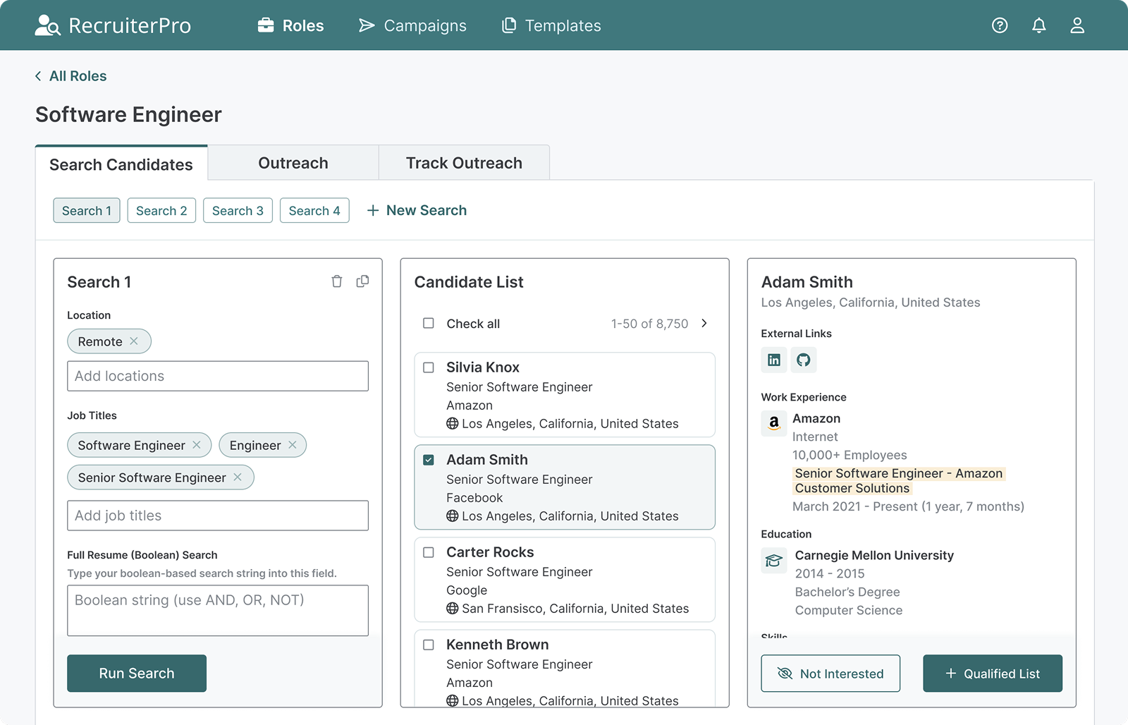
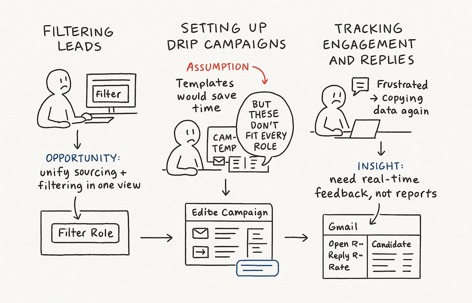
Working closely with the founder, I storyboarded three core journeys:
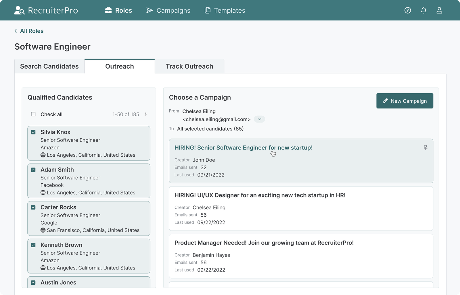
  1. Filtering leads
  2. Setting up drip campaigns
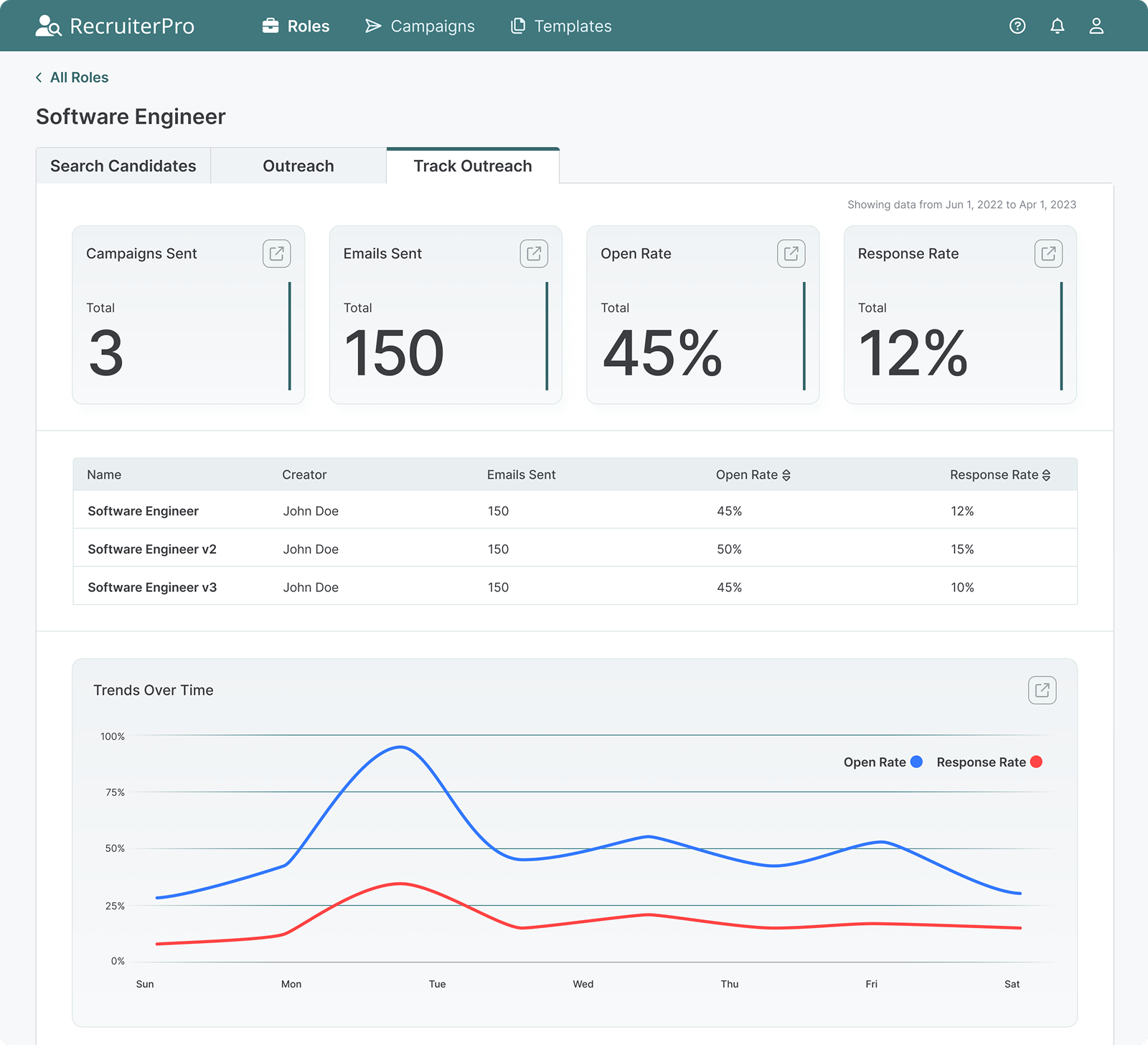
  3. Tracking engagement and replies
Early assumption: 
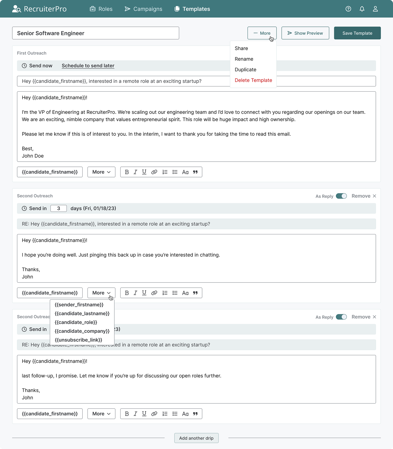
Campaign templates would be the hero feature.
What I learned: Templates felt restrictive. Recruiters wanted starting points they could customize per role, not rigid scripts. I shifted focus to inline customization—making it fast to personalize while maintaining flexibility.
This reframe changed everything: the platform wasn't about automation, it was about removing friction so recruiters could apply their judgment faster.
Visual: Early storyboard sketches showing journey mapping
High-Fidelity Design
After validating the wireframes, I moved into high-fidelity mockups in Figma. My goal was to make the interface calm and clear—no overwhelming dashboards, no buried metrics.
Roles Overview
The first screen users see after logging in. I designed role cards to surface critical information at a glance—my client emphasized that recruiters needed to assess status quickly without clicking into each role.
Tab navigation keeps users oriented, while the search bar and "Add New Role" button ensure the workflow stays fluid.
Visual: Roles screen showing role cards with status indicators
Candidate Search
This is where recruiters spend most of their time. I designed aggregated search to let users filter candidates, manage saved searches, and take quick actions—add to qualified list or mark "not interested" to move to the next candidate.
The tab structure keeps context visible: users always know whether they're searching, reaching out, or tracking performance.
Visual: Candidate Search tab showing filters and candidate results
Outreach Setup
Once recruiters have qualified candidates, they need to launch campaigns fast. I designed this view to offer flexibility—choose a template or build custom outreach—without adding complexity.
Visual: Outreach tab showing campaign templates and qualified candidates
Track Outreach
This is where the "no more spreadsheets" promise comes to life. Summary cards show performance at a glance, sortable tables let recruiters compare campaigns, and the line chart reveals trends over time.
The export icon allows quick data sharing—important for recruiters who need to report to founders or hiring managers.
Visual: Track Outreach tab showing analytics dashboard with charts and tables
Drip Campaigns
A streamlined table view for managing all active sequences. Recruiters can see campaign status, performance, and quickly add new campaigns without leaving the page.
The design prioritizes scannability—users told me they needed to assess "what's running" in seconds, not minutes.
Visual: Drip Campaigns screen showing campaign list view
Template Builder
Creating reusable templates was key to speed. I designed a multi-step builder where recruiters can add email sequences, set send times, and preview each touchpoint before saving.
Variables (like {firstName} or {companyName}) personalize at scale. Options to share, rename, duplicate, or delete keep template management intuitive.
Visual: Template creation screen showing email sequence builder
What I Delivered
Through research and iteration, I validated that small teams would adopt recruiting tools if onboarding friction was low enough.
  • Unified workspace design combining sourcing, outreach, and analytics
  • Real-time performance tracking eliminating spreadsheet dependency
  • Campaign setup reduced from 45+ to 15 minutes
  • Enhanced usability and hierarchy clarity through validated IA from card sorting and sitemap testing
Reflections
What I learned: The best tools don't add features—they remove decisions. Recruiters needed to see their work clearly and act confidently. This project taught me how to design with constraint—validating big ideas through small, testable interactions and using research to build conviction around specific design decisions.
What I’d do differently next time:
  • Earlier analytics planning: I'd define lightweight tracking from the start to identify where users hesitate or drop off, helping prioritize iterations faster than qualitative research alone.
  • Design system first Building a component library upfront would ensure consistencyu as new modules are added and make collaboration smoother across future features.first:
  • Structured experimentation framework: I'd establish protocols for testing design variants (filter placement, candidate sorting, scheduling UI) with clear success metrics tied to recruiting outcomes.
  • Phased validation approach: Rather than designing for a full-featured release, I'd structure the work around testable modules that could be validated independently with smaller user cohorts before scaling.