
- Taste-based personalization
- Streaming availability filters
- Rotten Tomatoes quality indicators
- Fast decision-support UI patterns
Movie & TV Show Discovery App
MovieFindr
Personalized movie and show recommendations.
Summary
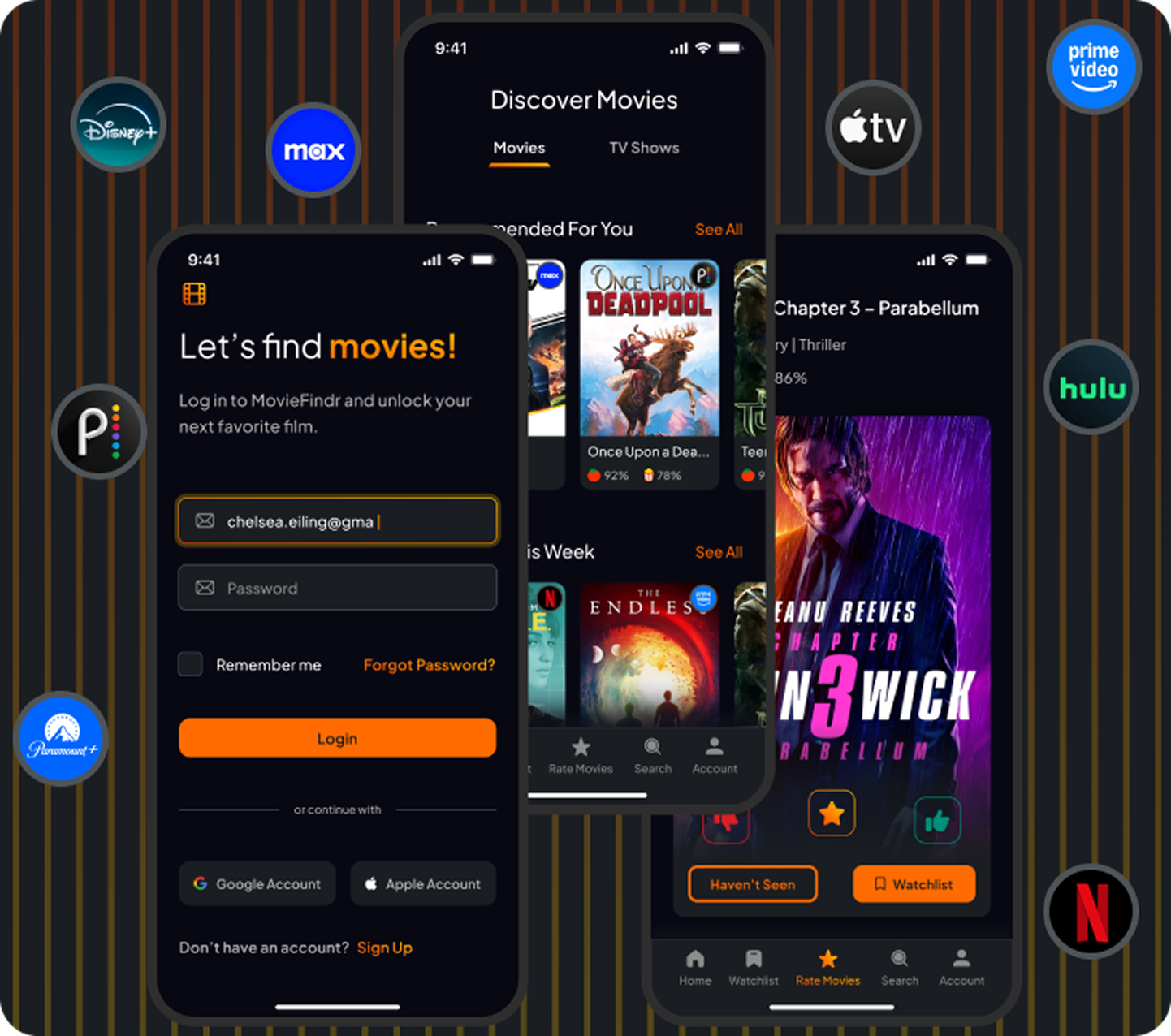
MovieFindr is a self-initiated product design project focused on solving a common user problem: decision paralysis when choosing what to watch across fragmented streaming platforms.
I designed a personalized recommendation app that helps users quickly discover high-quality movies and TV shows by combining:
At a Glance
My Role
- Product Designer (solo project)
- August 2022 – September 2022
Problem
Streaming users often experience:
- Endless scrolling across multiple apps
- Recommendations that don’t match their taste
- No easy way to filter by only their subscribed platforms
- Weak quality signals when browsing
- Decision fatigue from too many options
Goals
Primary Goal
- Design a recommendation experience that reduces time-to-decision.
- Improve recommendation relevance over time
- Centralize streaming availability
- Surface quality signals early
- Support multiple discovery paths (personalized + trending + top-rated)
🎯 Personalization Engine
To improve recommendation quality over time:
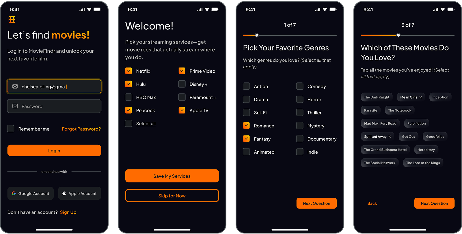
- Movie taste onboarding quiz
- Streaming platform selection filters
- Ongoing rating system feedback loop
- Preference-based recommendation tuning
Visual: Onboarding + taste quiz.
🔎 Smart Search & Filtering
Users can filter by:
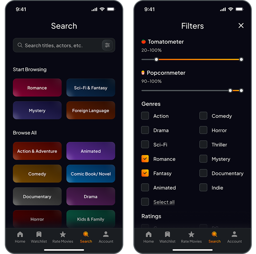
- Genre
- Rotten Tomatoes Score
- Streaming platform availability
Visual: Search + filters.
🏠 Homepage Information Architecture
Designed for multiple discovery modes:
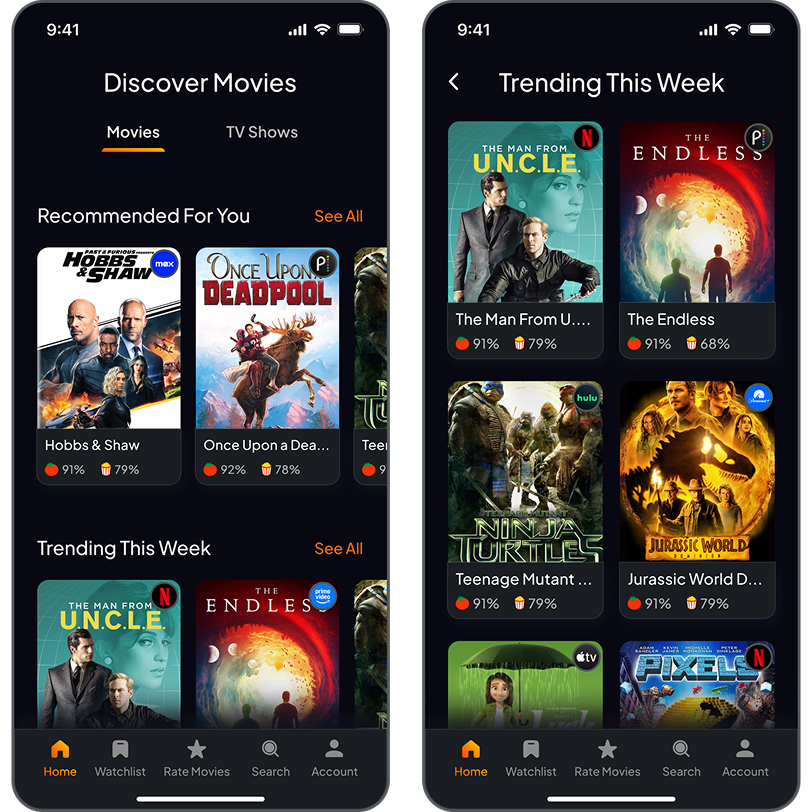
- 📌 For You — Personalized feed
- 🔥 Trending — Social proof + popularity
- 🆕 Recently Added — Recency-driven discovery
- 🍅 Rotten Tomatoes Top 100 — Quality-first discovery
- 📋 Watchlist — Saved decision queue
Visual: Homepage showing only titles that are in user’s preferred streaming services.
🎥 Movie Detail Page – Decision Screen
The movie detail page was designed as a decision hub, not just an info page.
Includes:
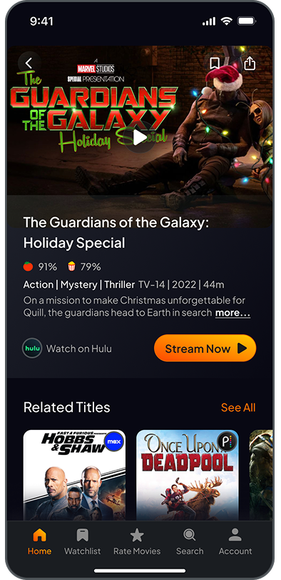
- In-app trailer playback
- Streaming availability indicator
- Rotten Tomatoes score visibility
- Related titles
- Rating interaction
Visual: Movie details page.
UX Decisions & Tradeoffs
Decision: Show Rotten Tomatoes score early
Tradeoff: Could bias discovery
Reason: Users already use ratings heavily — hiding them adds friction Decision: Filter by streaming services
Tradeoff: Smaller content pool
Reason: Increases immediate watchability Decision: Quiz + Ratings personalization combo
Tradeoff: More onboarding steps
Reason: Faster personalization accuracy
Tradeoff: Could bias discovery
Reason: Users already use ratings heavily — hiding them adds friction Decision: Filter by streaming services
Tradeoff: Smaller content pool
Reason: Increases immediate watchability Decision: Quiz + Ratings personalization combo
Tradeoff: More onboarding steps
Reason: Faster personalization accuracy
Success Metrics (If Shipped)
I would measure:
- Time to first watch decision
- Save-to-watchlist rate
- Trailer-to-watch conversion
- Rating participation rate
- Recommendation click-through rate
- Repeat weekly usage
- Filter usage frequency
What I'd Improve Next
I would measure:
- Collaborative filtering from similar taste profiles
- “Watch mood” quick selector
- Social recommendations from friends
- Smarter explanation labels (“Recommended because you liked X”)
- Cross-device sync
- TV interface version