Business Intelligence Web App
Lazer
Designed a 0→1 product that makes complex data approachable, trustworthy, and easy to use.
Summary
I collaborated with another designer to take Lazer from concept to launch, transforming a complex technical idea into an approachable platform that anyone in a company can use.
At a Glance
My Role
- Product Designer
- Two product designers
- One full-stack engineer/founder
- January 2025 – August 2025
Live Demo
Uncovering the Problems
Problem 1
- Non-technical users struggled with SQL-only tools → Surfaced in task walk-throughs and stakeholder interviews ("I have to wait for someone to pull this for me" was a common blocker).
- Teams lacked a shared language for key metrics → Surfaced in stakeholder interviews (“Everyone defines ‘active user’ differently depending on their team.”).
- Dashboards were cluttered, costly, and hard to trust → In competitive and heuristic audits of traditional BI tools like Tableau, Metabase, and PopSQL, I observed 8-12 charts per screen, filters buried 2-3 clicks deep, and dashboards showing data 12-24 hours stale.
Designing a clearer path from question → answer
In interviews, non-technical users said they often “wait for someone to pull it for me” because getting a simple metric meant knowing SQL or pinging an analyst. To understand what they were up against, I reviewed how current tools handled queries. Most required users to juggle data sources, SQL editors, and cluttered sidebars, even for basic questions like “How many orders did we get each year?”
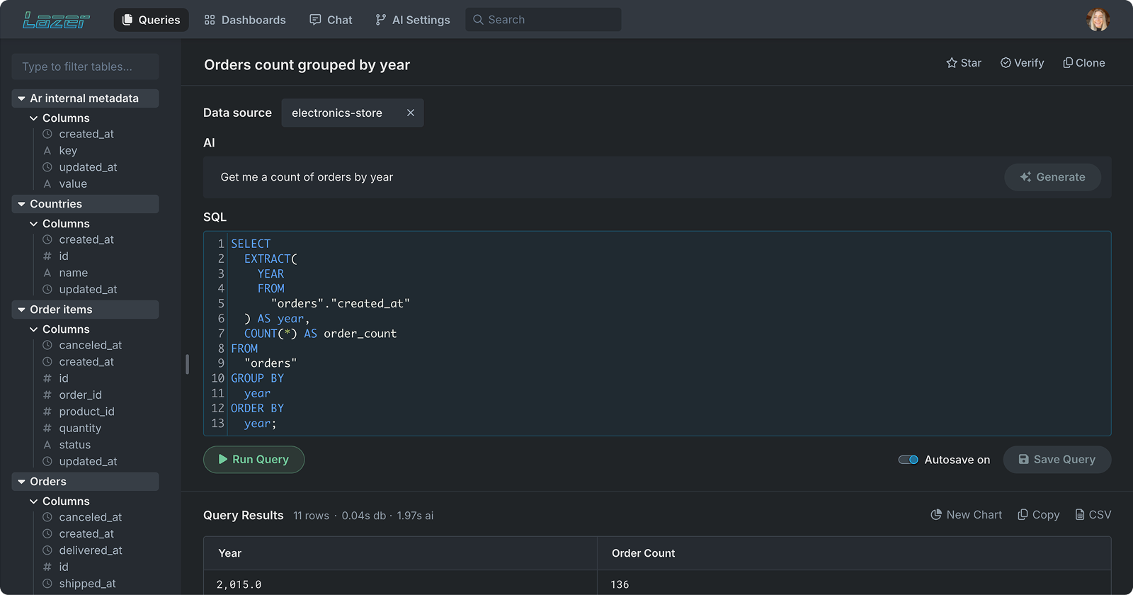
Visual: Query page showing “Get me a count of orders by year” → auto-generated SQL → trusted result.
This audit helped shape Lazer’s query experience: a clean workspace where anyone can type a question in plain English and instantly see the generated SQL and results side-by-side.
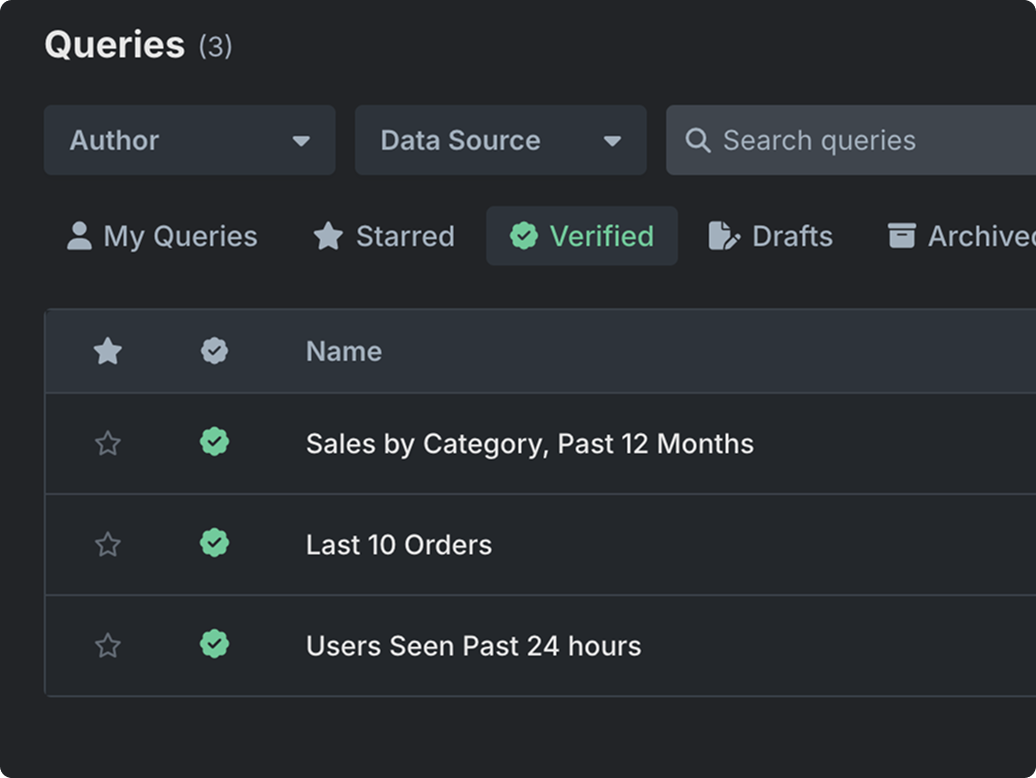
Visual: Verified queries (green check) make trusted answers discoverable.
Designing for trust without adding friction
In interviews, analysts told us they needed to “peek under the hood” before sharing numbers, while business users just wanted a clear, trusted answer.
To serve both, we built integrated SQL verification: every saved query can be inspected, verified, and starred by technical users, then reused by everyone with confidence.
Result: Experts get transparency; non-experts get a simple list of verified, ready-to-use queries.
Designing a single source of truth for metrics
Interviews exposed mismatched definitions—“active users” meant different things to each team. To align language and results, we introduced a shared definitions space where analysts codify metrics in plain English and bind them to data sources. From then on, queries and charts inherit the same rule set, so “active users” or “revenue” mean the same thing everywhere.
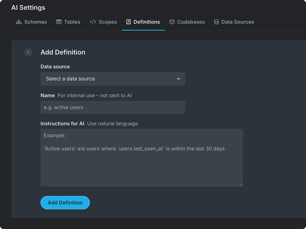
Visual: AI Settings → Definitions: select a Data source, give an internal name, and add natural-language instructions.
Reducing complexity with guided customization
Many BI tools overwhelm users with nested menus and rigid chart builders. Through user testing, we found people preferred direct manipulation – they wanted to see their data update as they built.
Lazer’s chart builder uses drag-and-drop headers so users can explore data visually without writing code. A collapsible panel keeps the workspace focused, while familiar controls (like line or area chart toggles) make customization fast and intuitive.
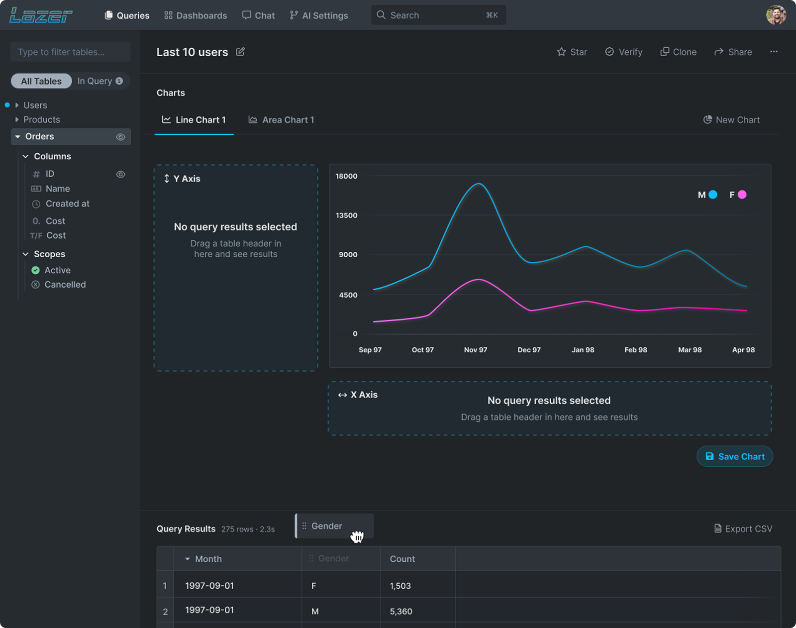
Visual: Chart builder showing drag-and-drop headers (e.g. Month, Gender, Count) to define axes and build visualizations. A collapsible data panel and real-time chart updates simplify exploration and reduce UI clutter.
Creating a single home for every dashboard
Users needed a faster way to find the dashboards they rely on, without digging through links. We built a top-level view that pulls together company dashboards, user-created dashboards, and starred favorites, with search, filters, quick actions, and editable colors/icons so each dashboard is instantly recognizable at a glance.
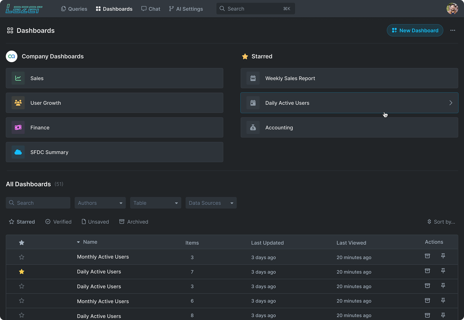
Visual: Dashboard overview with Company, Starred, and All dashboards. Users can search, filter, use quick actions, and customize each dashboard’s color and icon for faster visual scanning.
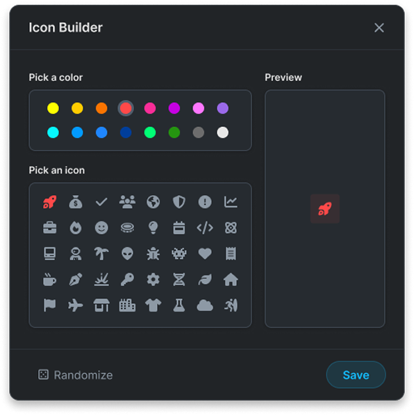
Visual: Modal for customizing dashboards.
Drag, drop, done
Users organize information differently, so dashboards shouldn’t be one-size-fits-all. Lazer lets you drag-and-drop widgets and resize cards to match your workflow, surfacing the metrics you care about and tucking the rest away. The result is a focused, personal workspace that keeps attention on what matters.
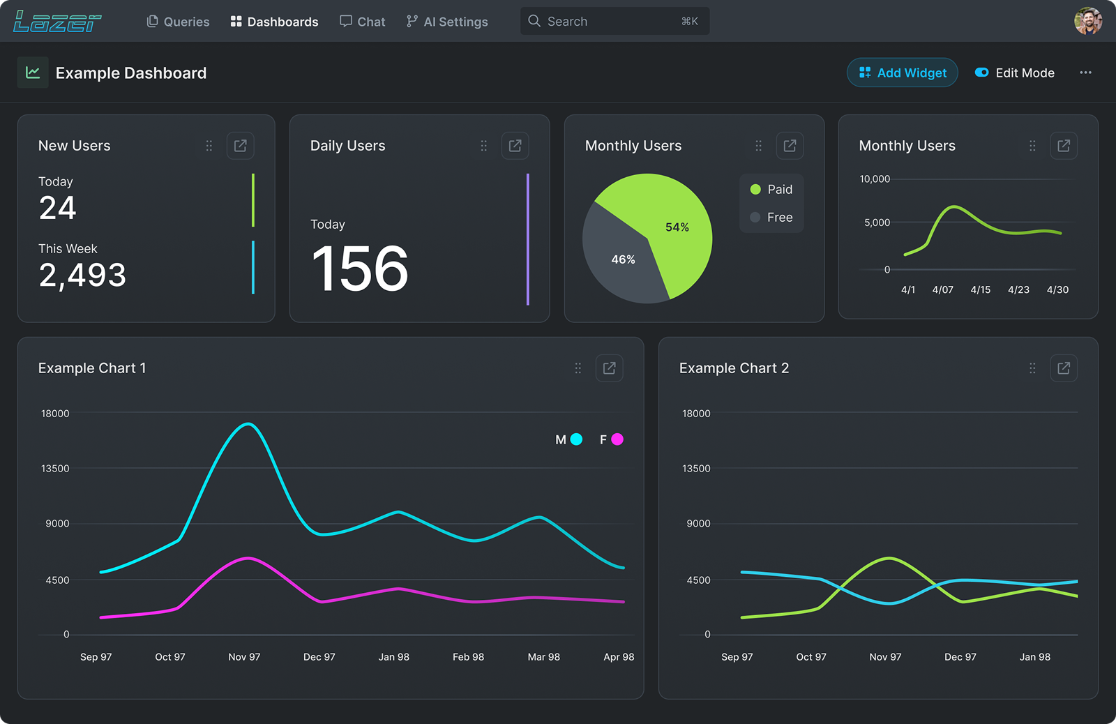
Visual: Dashboard in Edit Mode. Cards support drag-to-reorder and resize (handles in the top-right), so users can arrange KPIs, charts, and breakdowns into a layout that fits their workflow.
Results & Impact
- Shipped MVP in 8 weeks, covering 5 core flows (Queries, Dashboards, Chat, Definitions, Verification, AI Settings).
- Designed flows that allow non-technical users to run queries independently (0 SQL required).
- Reduced dependency on data teams by an estimated 30–40%, freeing analysts to focus on complex work.
- Built a 40+ token design system (colors, spacing, typography, states) for scalability.
Reflections
Things I’d do differently next time:
- Track time-to-answer, success rate, and which “Verified” queries people use, so we know what to improve.
- Clear roles and approvals. Decide who can view, edit, and approve definitions to keep numbers consistent.
- See the impact of changes. If someone edits “Active Users,” show which queries and dashboards will be affected before they save.
- Teach the right path on first use. Quick guided steps: pick a data source → run a Verified query → save a chart.
- Make it fast and usable. Set speed targets (pages load quickly) and ensure everything works with keyboard and color-safe charts.