
Dashboard Experience
Online Sports Mentorship Platform
Scheduling and Dashboard Experience Redesign
Summary
This platform connects youth athletes with college mentors through virtual mentorship built around confidence, accountability, skill development, and emotional support.
When I joined, the platform already had a working MVP. But as more guardians, mentors, and internal staff leaned on the dashboard, gaps started surfacing across scheduling, payments, session reporting, and support.
My job was to close those gaps — strengthening the dashboard behind the mentorship journey and refining flows on both the guardian and mentor sides, so everyday tasks became clearer, more complete, and easier to support as the product scaled.
At a Glance
My Role
- Contract Product Designer via Fullsend Solutions.
- Engineering, product managers, marketing, and graphic designers.
- October 2025 – January 2026
Uncovering the Problems
Athlete to Athlete depends on live sessions running smoothly. Guardians need to book, reschedule, pay, and get help. Mentors need to manage availability, join calls, complete recaps, sync calendars, track sessions, and get paid.
As the MVP grew, the dashboard had to handle more than the happy path. Users ran into same-day conflicts, intro-call reschedules, missing billing history, support requests, and post-session tasks.
My challenge was to fill these gaps for guardians, mentors, and staff without making an already working product harder to use.
Scheduling & Coordination
Booking and rescheduling were being treated as separate problems, even though users were doing the same basic thing: finding a time that works. Taking cues from Calendly, I designed one scheduling surface — choose a date, choose a time, confirm — reused across every entry point.
One surface, four entry points:
- Mentor books a session in-app
- Guardian books via the mentor’s link
- Guardian reschedules via the mentor’s link
- Mentor reschedules a session in-app
Mentor books a session in-app
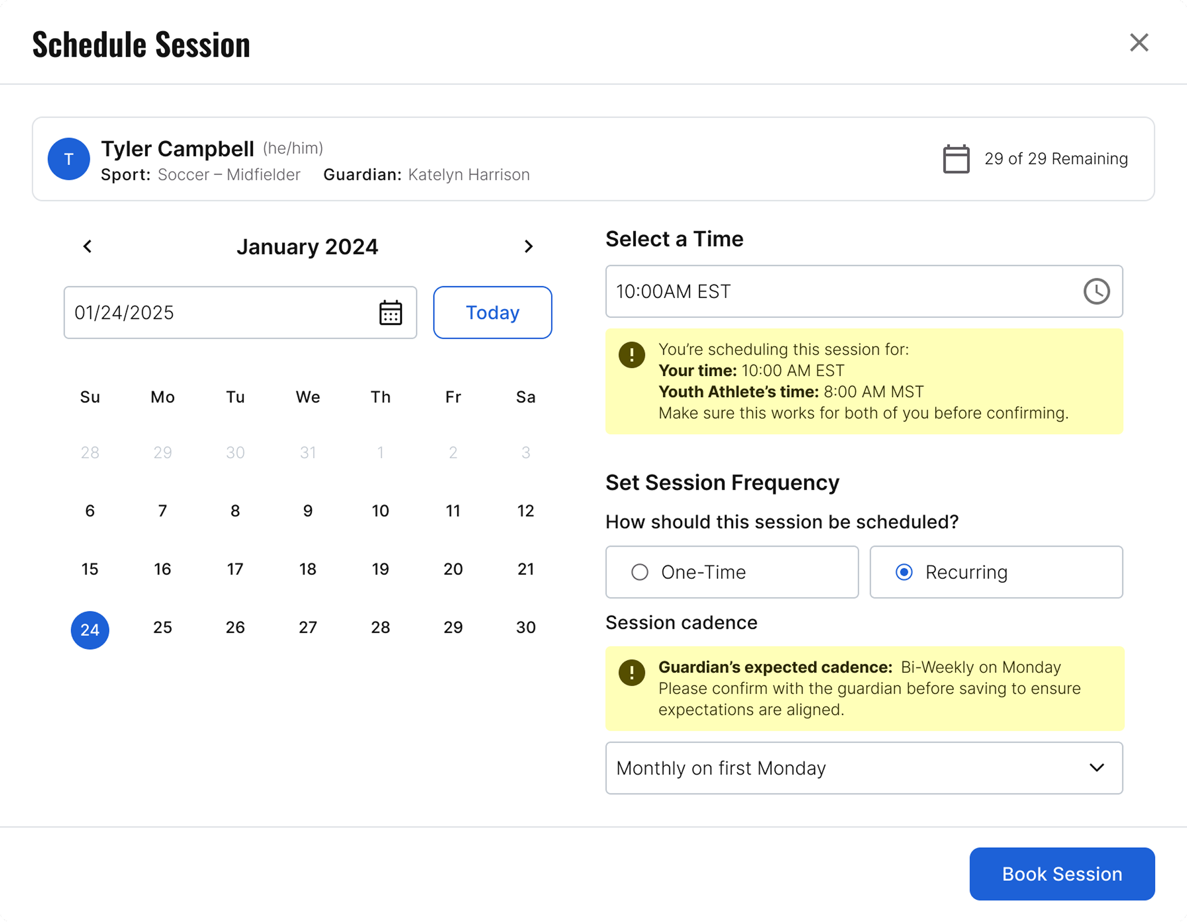
Visual: Mentor booking a recurring session using the same date → time → confirm pattern.
Guardian books via the mentor’s link
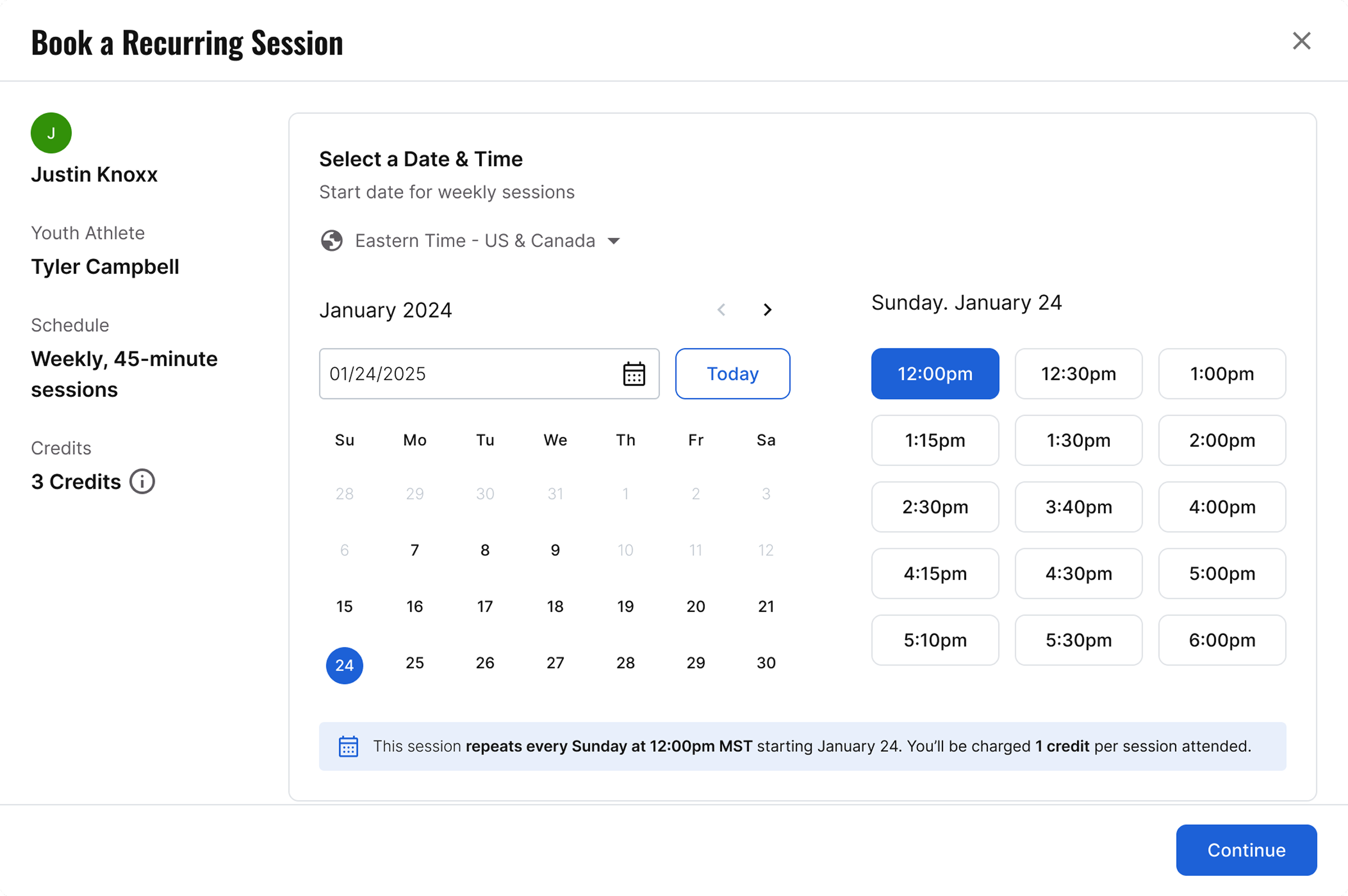
Visual: Guardian booking a recurring session through the shared scheduling flow.
Mentor rescheduling: simple on the surface, complex underneath
A single change could ripple across one session, all future sessions, guardian expectations, and hidden conflicts. Mentors had to choose scope while the system blocked unavailable times and flagged softer conflicts like same-day double sessions — so I mapped the full decision tree first, letting product, ops, and engineering align on the rules before any UI existed.
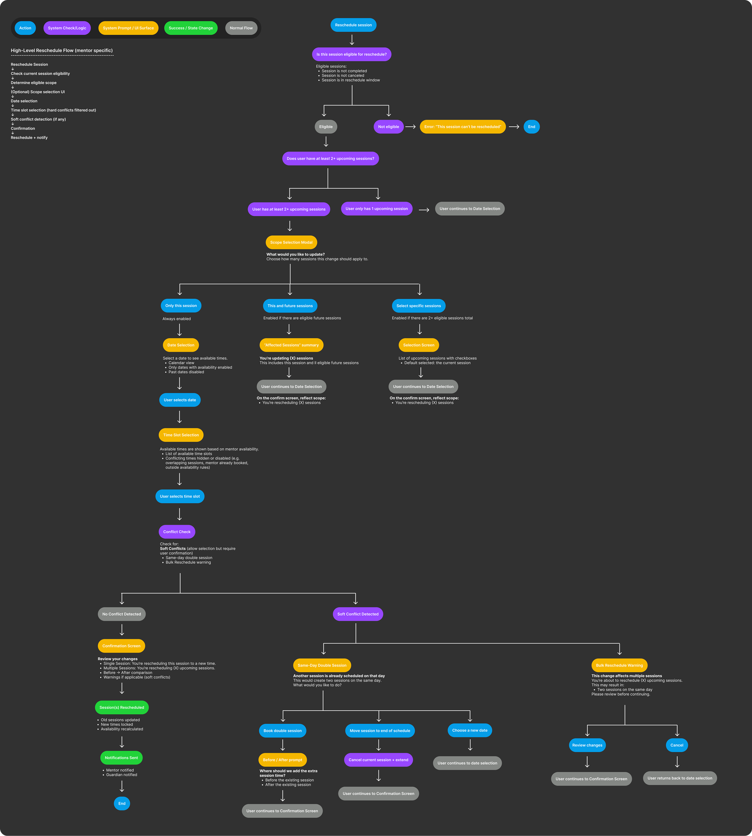
Visual: The full rescheduling logic mapped end-to-end before design: every branch, block, and warning.
Translating the logic into a guided modal
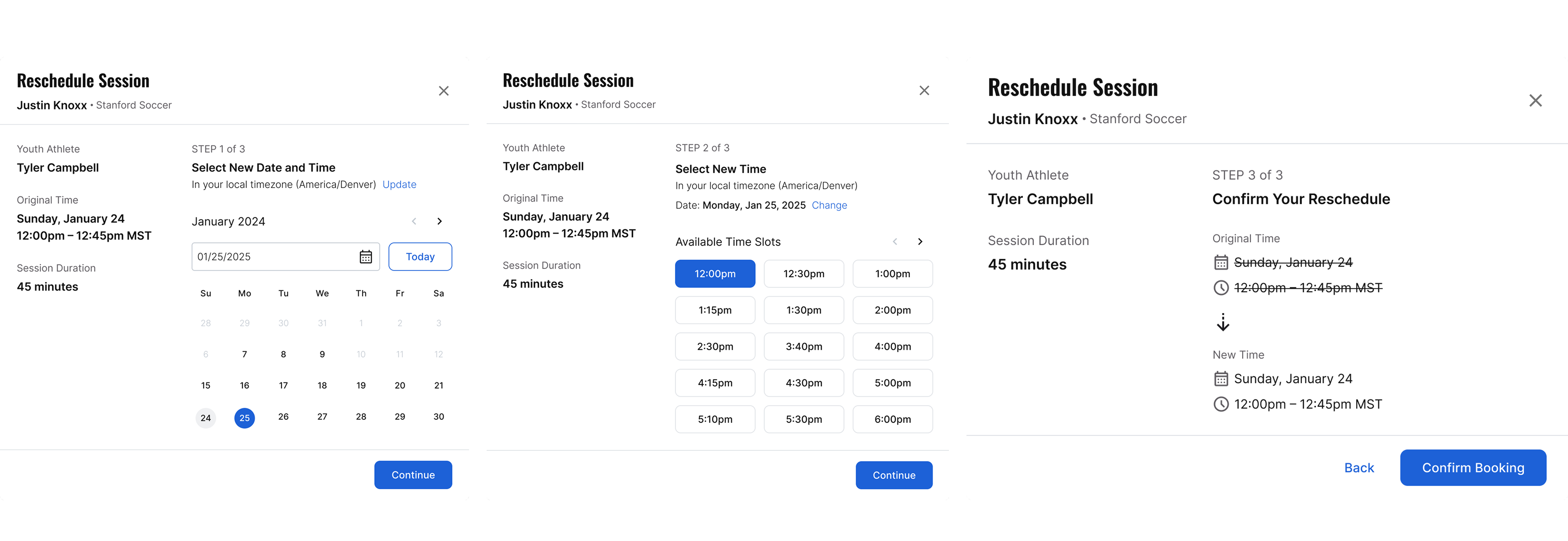
With the rules settled, I designed a modal that walks mentors through the key decisions — scope, new time, conflict resolution — instead of exposing every rule at once. It kept the team from shipping a fragile one-off flow, and gave mentors a confident way to change their schedule without pinging support.
Mentor reschedules a session in-app
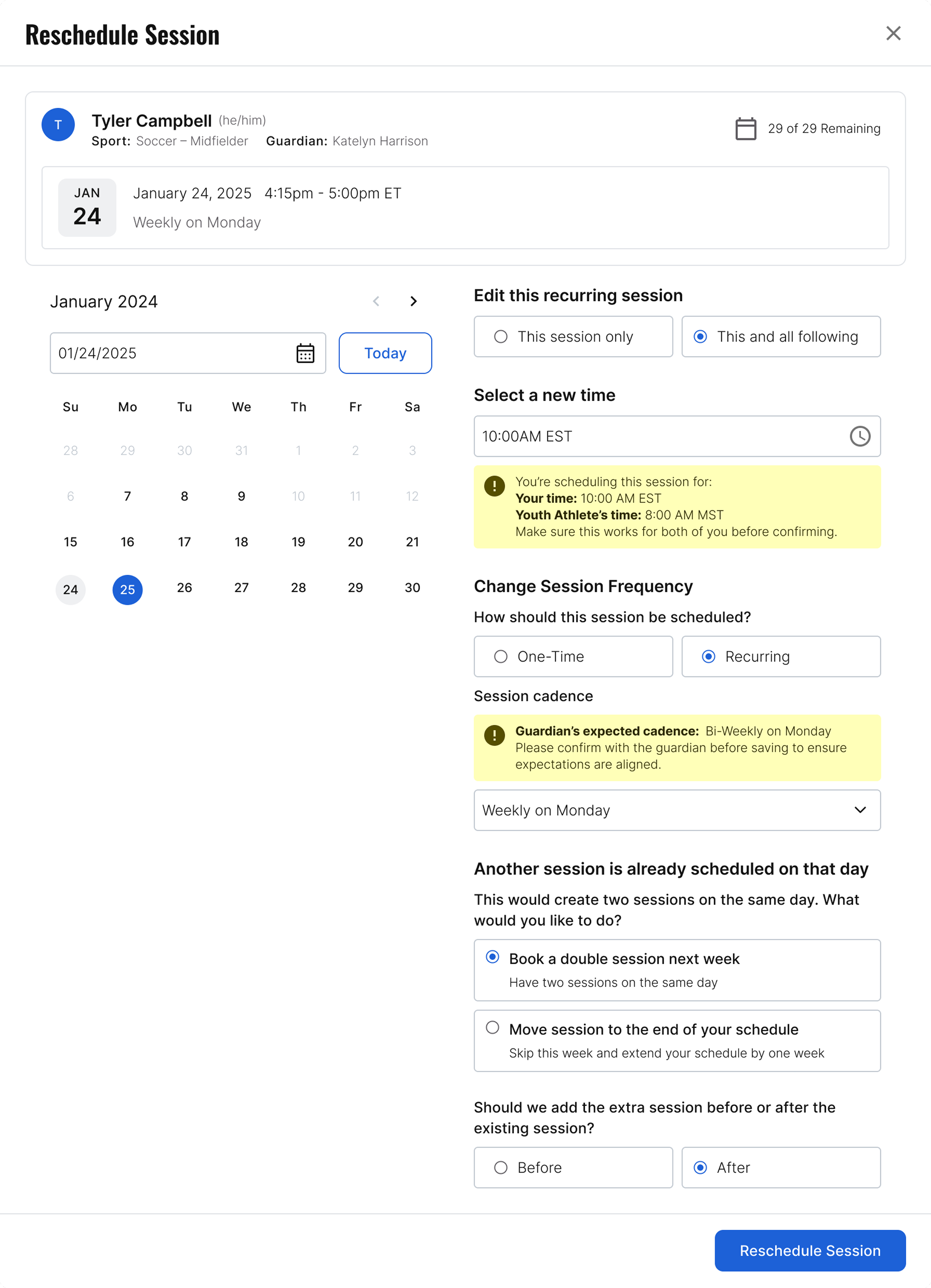
Visual: The guided rescheduling modal: scope, new time, and conflict resolution in one focused flow.
A different kind of reschedule: the intro call
Intro calls are a one-time, free 15-minute call where a mentor meets the student-athlete and guardian to see if it's a good fit, before anyone pays for mentorship. Constant reschedules routed through ops were turning into a steady stream of support tickets, so I designed a self-serve flow mentors could handle on their own.
The tension: steer mentors away from rescheduling without feeling disciplinary. A reschedule still beats a no-show, so it had to stay easy — offering small time-bump alternatives (15 min–1 hr) instead of forcing a full reset to a new day.
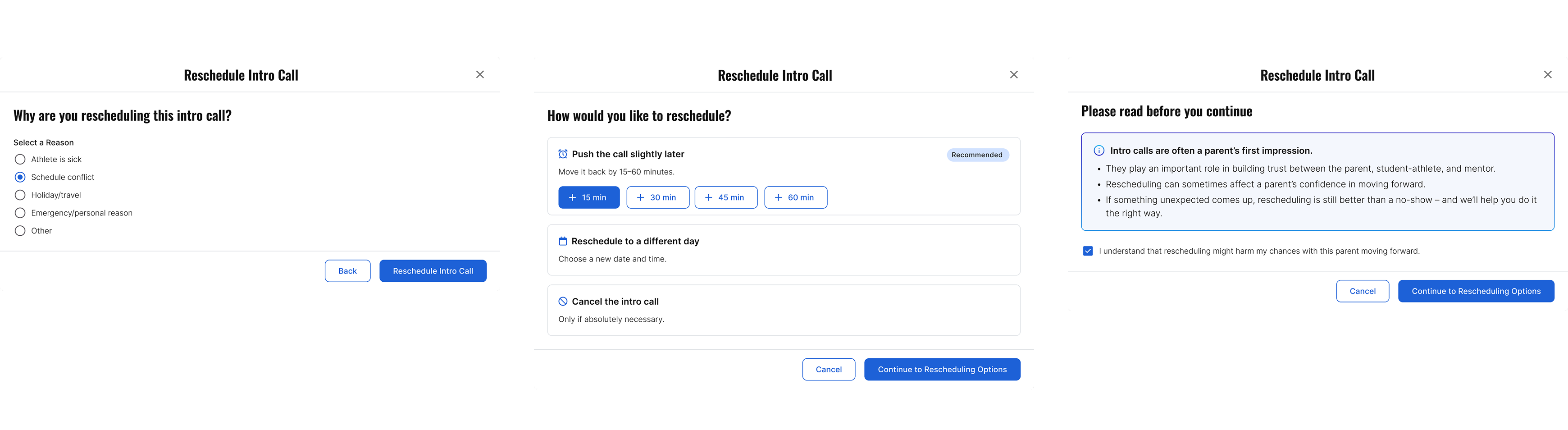
Giving mentors memory, mid-session
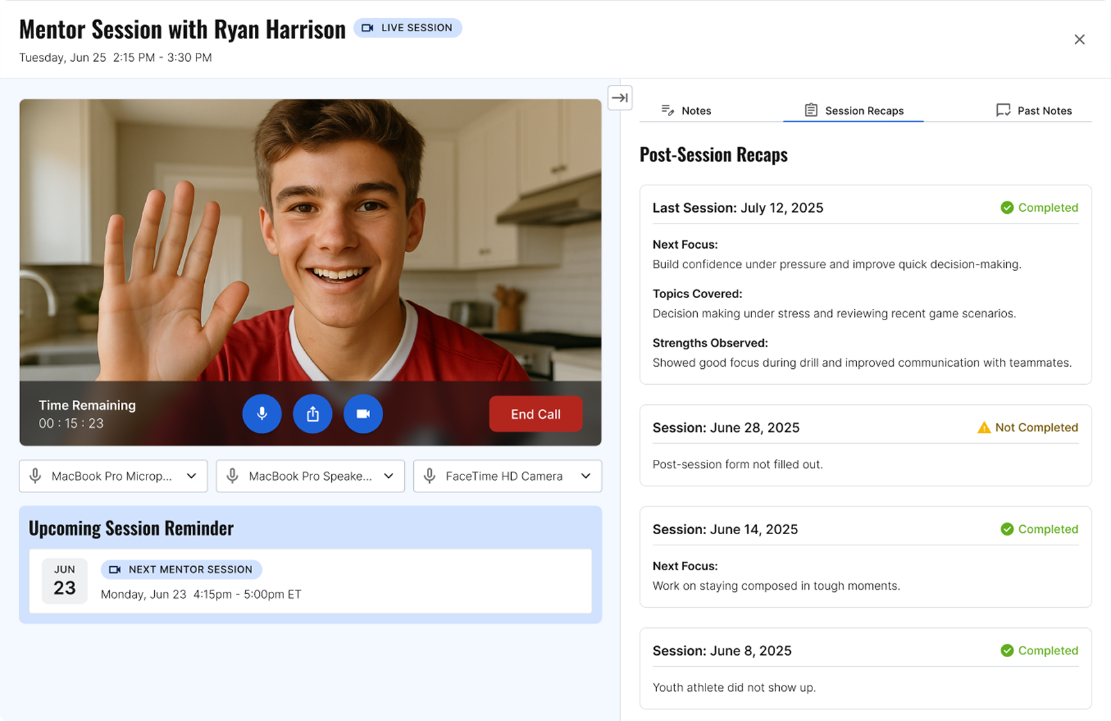
Sessions only count if there's a record of what happened. I focused on giving mentors context in the moment — without turning the live call into a research project.
Mentors leave every session with a post-session form — what was covered, strengths observed, what's next. But once submitted, that history disappeared. Mentors walked into each new session with no memory of the last one.
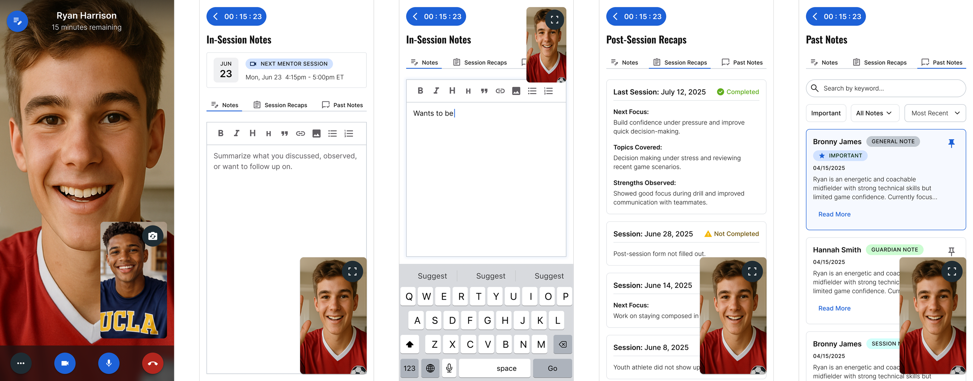
I added a tab inside the live session view so mentors could pull up past post-session forms mid-call — scannable at a glance, without competing for attention with the session itself. The hard part was density: the same content had to work on a full desktop layout and on a phone screen mid-conversation, without turning into a wall of text mentors would have to dig through.
PiP in action
The notes tab only works if it doesn't cost the mentor their session. Switching away from video to write something down couldn't mean losing eye contact with the athlete — literally or figuratively.
I designed the video call as a persistent picture-in-picture: it rides along as a small window over Notes, Session Recaps, and Past Notes, and expands to fullscreen with one tap. Mentors move fluidly between "in the conversation" and "referencing the record" without ever fully leaving either.
Designing the Payouts tab 0-1
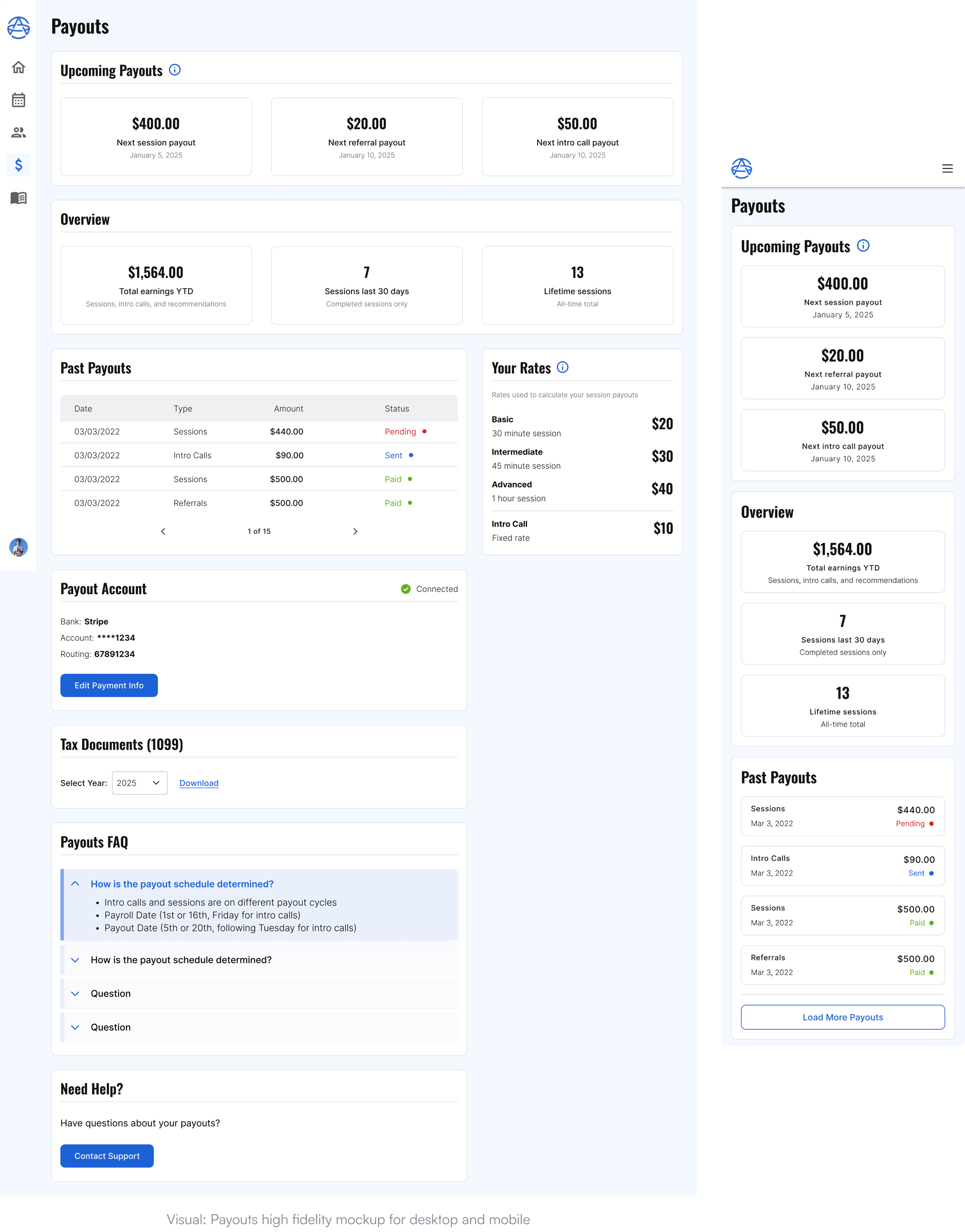
Payouts didn't exist yet — I started from a product spec, not a screen. It named the goals (know your rate, see what's next, review the past, find tax forms) but left the hard part unresolved: mentors are paid on two separate cycles, at rates that don't translate cleanly into an hourly number. I ran several rounds of wireframes to pressure-test structure, then built the approved version in high fidelity using the existing design system, adding new components where nothing quite fit.
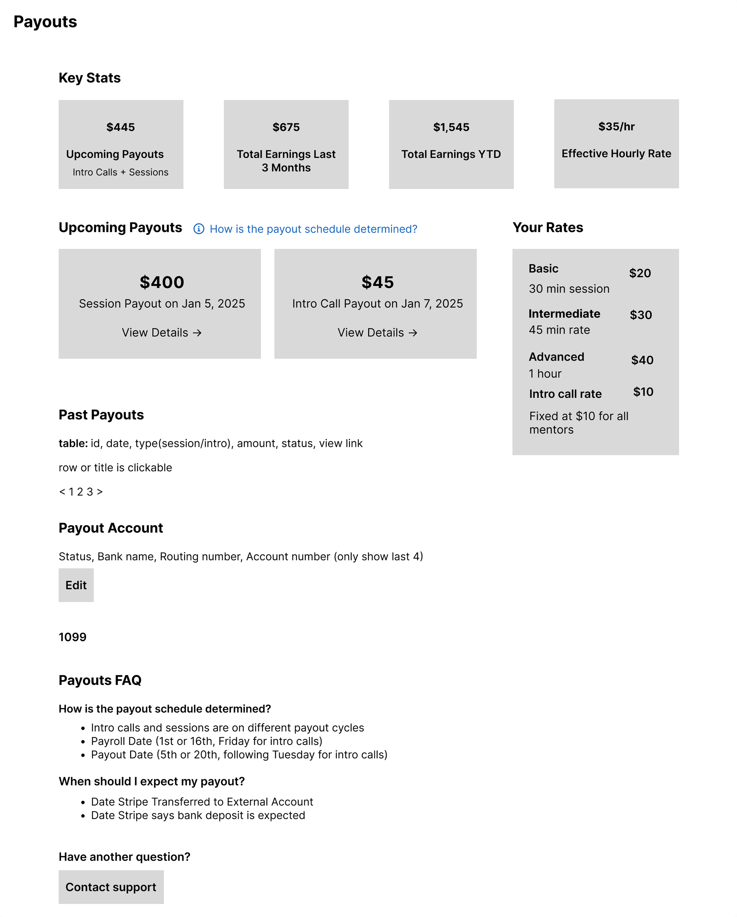
Visual: Initial Payouts wireframe
WHAT CHANGED BETWEEN WIREFRAME & FINAL:
- The wireframe blended everything into one "$35/hr" stat. I replaced it with a per-length rate card — mentors trust a rate they set over one the system computed for them.
- Referral payouts surfaced as real data mid-project — a third payout type the spec hadn't accounted for, so I added it alongside sessions and intro calls instead of forcing it into either.l
Impact
- Mentors and guardians can now book, reschedule, and manage sessions without staff, reducing scheduling tickets.
- Scheduling rules that once lived in mentors’ and ops’ heads are now built into the product, creating a foundation for future features.
- Mentors can manage a family’s first session themselves, protecting an important first impression without escalating to staff.
- Payouts answers two of mentors’ biggest questions: how much they are earning and when they will be paid.
Reflections
- With this many edge cases, mapping the logic before designing the UI was essential. A decision tree kept product, ops, and engineering aligned.
- Tone was part of the interaction design. The intro call copy needed to guide mentor behavior without sounding punitive.
- Each workstream could have become its own case study. Focusing on the most important decisions kept the story clear.
- This is one part of a larger system that is still shipping.